How to create a logo? - Short guide

Author: Connect

Published

03.04.2019

Time to read

0 min read

If you are a startup and trying to distribute an already small budget optimally, then we will help you set priorities and explain in detail what you need a logo for. Our blog post is also useful if you are just wondering how to create a quality logo.

Will any big brand be remembered without a logo? Such a brand does not exist in nature. Existing and potential customers have an idea of ​​the company, first of all, based on the logo. Perhaps you want your company logo to stand out, but you probably don't know how to get the desired result.

Don't worry, our step-by-step guide will explain everything you need to create the perfect logo - from the general characteristics of the logo and your brand identity to working directly on the logo design.


5 steps to creating a logo:


  1. Figure out what you need a logo for.
     
  2.  Before you start making a logo, plan it.
     
    • Define your brand identity
    • Find inspiration
    • Study the competitors
       
  3. Start working on the logo design
     
    • Choose a design style
    • Select the appropriate type of logo
    • Pay attention to colors
    • Choose the right typography
       
  4. Manage the design creation process
     
    • Keep in touch with the designer
    • Evaluate options
    • Common mistakes that should not be made
       
  5. Use a logo

     
Image alt text

1. Figure out what you need a logo for
 

A logo is your business's business card. It's the first thing potential customers will see, so you need to offer the best version tailored to their tastes.

The logo first gives information about your brand. Oftentimes, the logo alone determines how much a customer wants to interact with your brand.

Also, you should not forget that the logo is not created for one-time use, it will be everywhere and on everything related to your company - on the website, packaging, business card, even a simple letterhead. Therefore, you should try to make your logo particularly eye-catching and stand out from competitors' logos.


2. What should you do before designing a logo?
 

Define your brand identity.

Your logo should convey the character of the brand. First, define what your brand is. When you know in detail what makes your brand unique, it will be easier to work on logo design.

If you don't know where to start, follow the questions:


  • Why did we start this business?

  • What beliefs and values ​​are important to us as a company?

  • What do we do better than others?

  • What makes us special?

  • If we were to describe our brand in three words, which three words would we use?

  • Ideally, what three adjectives should customers use to describe us?


Find inspiration

When it comes to designing, the hardest part is finding inspiration. That's why we have prepared tips for you.

Start with brainstorming

If you want a clear logo concept behind you, start gathering ideas early. Brainstorming helps you identify different ideas, goals, and creative ideas.


  1. Do not deviate from the main rule of brainstorming - sound out and write down any idea. Voicing the most useless idea can lead you to the truth.
  2. Think like a target segment - don't lose sight of the worldview of the people your company is meant to serve. Always remember what is important to them, what they like, and what they find unacceptable. Write down the words that you think describe your brand and also write down the adjectives that you want your company to sound like.
  3. Involve everyone - don't make one-sided decisions. Involve employees from other departments, call business partners or even friends. At the initial stage, listening to different opinions will help you achieve better results.
     

When it comes to your logo, don't be a template. An original solution can make you stand out in the market and thus you can better convey the unique character of the brand.


Create a mood board

Work on the logo is not limited to verbal and written requests. The best way to get inspiration is to create a mood board. If you have the time, printing, cutting out, and putting the materials together in one space wouldn't be a bad idea, but you can also use digital tools and create your mood board on Pinterest. Collect the images you like, and collect everything - logos, illustrations, and graphic works. With this method, you will soon discover which style you like.

Have you started thinking about how to express your business with a logo? Choose a brand aesthetic - a vintage style or a loud, clear, and modern image.


Study the competitors

Even if you are going to enter the market with an innovative product, look at your competitors. Of course, we don't think you should steal ideas from others, but we recommend that you take a good look at what others are doing. What kind of logos do they have? Which one is most liked by the target audience? Figure out what you want to represent and think about how you'll reflect the differences in your logo design.

If you want the difference between you and your competitors to be very clear, you need to create something radically different. For example, if most businesses in your field use monochrome designs, you can incorporate colors into your logo. If everyone has chosen a traditional style, a modern and fun logo will attract more attention.


3. Start working on the logo design
 

Now that you know what your brand is and you're inspired, it's time to put your knowledge and energy into a logo. The visual side of a logo consists of many elements - colors, shapes, graphics, and typography. We will consider each component separately.

Choose your design style.

First, you need to find the right aesthetic for your brand. No one style suits all companies, you have to find the right one for your company.
.


classic

Trendy logos may be attractive today, but tomorrow and the day after that they will no longer be suitable, they will go out of fashion and become obsolete. The classic style will last longer and allow you to reach more people. The classic style is simple and plain, avoiding loud colors, unusual graphics, or fonts. A classic style tells consumers that your brand is trustworthy.

Image alt text

Retro or vintage

Have you ever wondered why people love vintage and retro? Is it because this style evokes romantic feelings in people and evokes nostalgia? The message of retro style is also clear - history and product quality are important for the brand.

Image alt text

Modern and minimalist

Brands often choose a simple and minimalist style. In such logos, you will find wide white spaces, minimalistic details, and simple lines. Minimalistic logos emphasize that your brand promotes modernity.

Image alt text

Light and cheerful

If the main target segment is young people, then choosing an unconventional and cheerful logo is justified. To create a positive mood, such logos often use colorful colors, symbols, and illustrations.

Image alt text

created by hand

The handcrafted style conveys a clear message: this brand is individualistic and focused on handcrafted quality. This style can most easily be combined with other directions, choose vintage, minimalist, or light style as desired.

Image alt text


Can't agree on one style?


Not every style suits everyone else, however, depending on your brand, you can combine several directions, for example, handmade and fun.


Select the appropriate type of logo.


The logo graphically represents the company's unique identity. A total of 7 different types will be distinguished.

All types of logos are a combination of typography and icons, but each one represents the brand differently. If you're wondering which type fits your company's profile and values, keep reading.


words and letters
 

1. Monogram logos


CNN, HP, HBO... these brands have one thing in common. All three are positioned in the market with initials - monogrammed logos are used for identification. All three have long and hard-to-remember names.

Monogram logos are based entirely on typography, with a few letters in the logo, usually the initials of the company. These types of logos are simple and effective. Let's recall the example of NASA, pronouncing the full name of the organization and perceiving the logo is almost impossible. On the one hand - NASA, on the other hand - the National Aeronautics and Space Administration.


2. Typographic logos (logotypes)


Like a monogram logo, typographic logos use the font as the main focus. Such logos are most impressive when the company has an easy-to-remember name. Visa, Coca-Cola, and Google have this type of logo..


Typography is so crucial that it's best to create a unique font for your brand. The slant, length, width, and size of the letters should graphically convey the essence of your business. Fashion houses use sophisticated, elegant fonts, while public agencies prefer traditional, more formal-looking typefaces.


When should you use monogrammed and typographic logos?
 

  • If your business has a long name. Using initials will simplify the design and make things easier for users, they will remember the company and the logo more easily.

  • A typographic logo is optimal if you are new to the market and want to establish yourself. In this case, the business name should not be too long if you want the logo to appear "tight" and curvy.

  • Consider choosing a typographic logo even if you have a unique name that is most likely to resonate with users.

  • Both logotypes are easy to use and transfer to different materials, thus making them beneficial for new businesses.

  • You should not forget that creating these types of logos is time-consuming and requires the involvement of a team of technically strong designers. Logo designers have to pay a lot of attention to each part of the letters to make the result look impressive.


Images and symbols


3. Graphic signs (logo-symbols)


The logo symbol is the type that comes to mind first when we think of logos - Apple's Bitten Apple, Twitter's Bird... Such images are used by big brands that do not need to indicate the company name and are easily recognized only by the symbol. Using this type of logo is risky for start-up businesses.


The chosen sign or symbol should reflect the values ​​and activities of the entire company. It has what you need - to evoke an emotion, to communicate the brand philosophy, to connect the sound of the company name and the symbol in an original way, or something else. For example, the logo of the World Wide Fund for Nature symbolizes the panda as an endangered species.


4. Abstract logos


Abstract logos are a special type of logo symbol. In this case, we are not dealing with easily perceived symbols (bird, house, apple), but we are looking at abstract, geometric shapes. Pepsi, oil, and gas corporation BP, and Adidas have such a logo. An abstract logo will allow you to create a unique and distinctive symbol, however, it is relatively difficult to perceive such symbols and identify the company. You can still try to evoke a special emotion by using colors and geometric shapes. For example, the Nike symbol manages to reflect movement and freedom in a minimalist and tasteful way.


5. Mascots


You can use an illustrated character to represent your company. Imagine that this hero is your brand ambassador. In the case of M&M and KFC, we deal with mascots. Character creation works best when it comes to families and children. Mascots are also very popular in sports, as characters can be used at sporting event


When should you use pictorial and symbolic logos?

  • The use of logo symbols is appropriate if it concerns a well-known, large brand. You can break the rule if you want to convey a specific idea or emotion.

  • Logo symbols and abstract logos are the best choices if we are talking about global business. Some names don't translate well and are better just represented by a symbol.

  • We do not recommend using a logo symbol if there is a high probability that you will change the business model. If you put a pizza on the logo and then switch to selling khinkle, the customer may be confused and dissatisfied.

  • Abstract logos are unique but require special professionalism. A competent and experienced designer should combine colors, shapes, and structures tastefully.

  • Consider a mascot if you plan to host many events. A mascot is useful both in the digital world and at real events, where a costumed actor will appear as your character.

  • Keep in mind that it will be difficult to apply the talisman to all materials. A detailed illustration is difficult to transfer to a business card, the image must be small, and the details are ugly.
     

6. Combination logos

Such logos combine a symbol and a word, with the brand name either next to the symbol or integrated directly into the symbol. Consumers associate both the name and the symbol directly with the company.

If you want to establish a name and create a clear associative chain of customers, the combination is a good option. You kill two birds with one stone, you also make your company's name sound and you have something to say in a specific symbol.


7. Emblems


 In the case of emblems, the text is integrated into the traditional form. Such logos are characterized by overloaded graphic elements and text. Emblems are most often used by universities, public agencies, schools, and similar specific institutions. Interestingly, emblems have also undergone a kind of modernization and brands have stepped into the 21st century, remember the Starbucks logo and you will agree that it is not at all too traditional or old-fashioned.

In the case of the emblem, the problem is still to put the logo on different materials. When the image is too small, the logo becomes unintelligible.


When to use combination logos or emblems:


  • The combination logo is suitable for almost all businesses. Most often, companies choose this option.
  • Emblems are preferred by public agencies and schools, although private companies are also free to use the option - emblems are particularly suitable for companies and facilities that produce snacks or food. You need to be careful with the details so that you don't run into problems when printing or making materials.


Pay attention to the colors.


Every color evokes a different emotion and the ideas behind the colors are also different.

Red - expresses passion, fury, and admiration. It's a good choice if you want your brand to look energetic, loud, and youthful.

Orange- Less flashy than red, but just as vibrant and eye-catching.

Yellow - accessible, youthful, and friendly. If you want the distance between your brand and the customer to be as small as possible, yellow is a good choice.

Green - universal, fits all brands. Ideal for those who want to emphasize the connection with nature. Also, according to consumer surveys, the color green is most associated with trustworthiness.

Blue - a classic color, a frequent choice. Expresses reliability and responsibility, and evokes a feeling of calmness and stability.

Purple - mystical, eclectic, or extremely feminine. It all depends on which shade of purple you choose.

Pink - If the brand wants to express tenderness and sophistication, pink is perfect.

Brown - best suits masculine, vintage logos. It gives the brand a unique, slightly old-fashioned touch.

Black - sophisticated, modern, and luxurious. If you are looking for simplicity and simplicity, you can combine black and white.

White - the color of purity, modernity, and minimalism. Besides, white goes well with other colors.

Gray - if you want your brand to be classic and serious, choose gray. Dark tones of gray express mysticism and light tones evoke a feeling of accessibility.


color combination


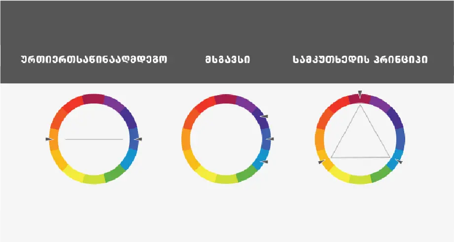
To perfectly convey the essence of the brand, one color is not always enough, however, you should be careful and choose colors that match each other. Look at the color circle.

Opposite colors are located opposite each other on the circle. By combining these colors, you will get a dynamic and sharp logo.

Similar colors are close to each other on the circle. If you want your logo to radiate harmony, choose similar colors.

By combining colors arranged according to the triangle principle, you will get a bold combination. In such a case, you choose the colors according to the triangle principle, that is, you use the colors that would be near the vertices of the equilateral triangle.
 

Choose the right typography


At this stage, you already need a font that will match the other elements and give the logo a finished look. There are 4 font types that you can use.


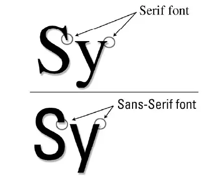
Serif fonts

The letters in serif fonts have small "points" which can make the logo look a bit old-fashioned, but instead, such letters suit almost all designs, especially vintage and classic options.

Image alt text

Sans serif fonts


For a modern and simple look, using Sans serif is advisable. Simple and elegant Sans serif fonts are best suited for minimalistic logos.


Handwritten fonts


Handwritten fonts are more individualistic, less strict, and less formal. There is a huge difference in handwriting-like fonts, it's up to you whether you choose an elegant and clean handwriting-like or a more relaxed and carefree typeface.

Display fonts


Display fonts are highly stylized, decorative fonts and are the easiest to draw attention to.

Put different design elements together.


Since you already understand more or less what elements the logo consists of, it's time to assemble the components and give the logo a full-fledged look and distinct character. The main thing is not to lose the charge of your brand and harmoniously assemble the elements.


4. Manage the design creation process


You need to think about which way you will go - hire an agency, find out the best logo through a competition, or entrust the work to one person. Every choice has its price and suitable quality


Stay in touch with the designer.


The first rule to follow is to clearly state and communicate your needs and desires. It is not enough just to convey the technical requirements, the designer must know what your company stands for, what goals and values ​​drive you, who is your primary segment and what you need to emphasize. The more information a designer has, the better able they are to create a logo that is unique and tailored to your company.


Although the logo will be your company, you should not forget that the designer is a professional, he has more knowledge and competence in this field, so you should trust him. Your feedback on individual elements or options of the logo should always be detailed and formulated, the designer should understand what you like and what you don't.


Evaluate the options


Sometimes you look at a logo and realize it's exactly what you need. More often, you can't make a clear choice, so it's better to ask partners, friends, and potential customers for help. Ask general questions to identify the best option:

  • Can you guess what this business does in a few seconds?

  • Is the logo easy to remember?

  • Is the logo universal? Will all the necessary space and materials fit?

  • Will the logo be useful for a long time or will it be replaced in a few years?

  • Is the logo unique? Or are they too similar to other brands' logos?

  • Will users like it?


Naturally, the requirements of brands for logos are different. So, where will you most often need to place your logo - fabric, labels, or digital materials? Don't just get stuck in personal taste, think about what will be most optimal for your company's daily activities.


Common mistakes that should not be made

  • Don't follow industry clichés, don't be stereotyped. Do not think that if you have a dental clinic, a tooth and a brush should appear in the logo.
  • Don't overcomplicate it. Genius lies in simplicity.
    • Do not follow trends. Pay attention to what's popular, but don't base the whole concept on trends alone.
    • Do not work with beginners, it will only waste your time and nerves.


What happens next


You have already created a solid foundation and now you can take care of other elements of branding. Start printing business cards, designing labels, or doing web design. You already have the style, color scheme, font, and most importantly, the required image. Good luck in your future endeavors!


Image alt text